Visual Novels and anime are fairly different media, something that comes across whenever a work originally created in one format is adapted into another. And certainly whenever fans of the original inevitably comment about the adaptation not living up to its potential. With VNs, creators have as much time as they need to tell a story, and can use branching paths to allow the player to choose their own story (to an extent). With anime, the amount of time allotted to tell a story is limited by the production budget, but the number of different visual techniques available to the staff is vastly superior. In both cases, the work makes use of voice acting, music, and visuals, but these two media are obviously quite different. Still, visual novels occupy this interesting space in the realm of adaptations because they do feature voices and color and the main changes from the adaptation process involve more motion and camerawork; examining aspects of how they’re adapted can be a good way of attacking the question of just what’s appealing about each medium.
Character designs compete with plot summaries to be the first thing most people notice about a visually-oriented story, and they serve discrete roles in both VNs and anime. I figure a decent tack to start on is to look at a work that got adapted multiple times, so you can look at different choices different designers make in the adaptations process. So what follows is a cursory examination of one aspect highlighting this difference, the character designs, for 3 major versions of Kanon (the original game, the 2002 Toei anime, and the 2006 Kyoto Animation anime). There are a decent number of series that got the double-adaptation treatment (Kakyuusei, Fate/stay Night, Air, etc.), but I’m picking Kanon because a) the designs for all 3 versions are readily available in easily-processed formats and b) the general reception is markedly in favor of the 2006 adaptation over the 2002 one. Images used for comparison are taken from the game data (from the armpits up, as found here) and the official websites for both the 2002 and 2006 anime. These base images don’t always reflect the way characters appear – anime can scale up or down on details in dramatic/motion-heavy scenes, and VNs can highlight different features from different angles during event CGs – but they provide a useful baseline.
Full disclosure: I have not played or watched any version of Kanon, so I lack understanding of anything more than the basic context regarding the plot. This post is mainly the results of my playing around with the character designs for fun and seeing what I can get out of with them. Not that I haven’t read up a bit for some general context.
Since I’m going to be talking about the character designs a lot starting now, it’ll probably help those reading to have some context. Have a look at each set of designs for yourself!
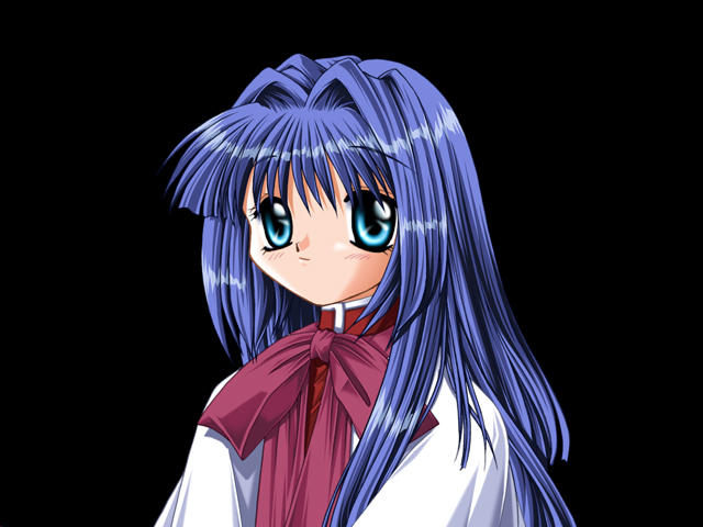
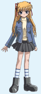
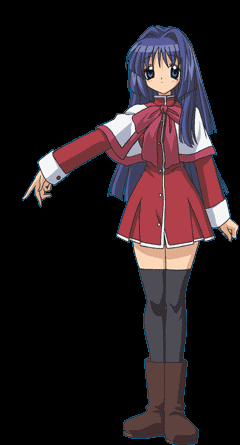
Visual Novel designs (Hinoue Itaru):


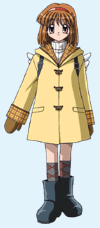
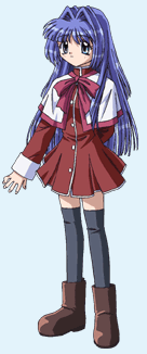
2002 anime designs (Ohnishi Youichi):
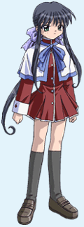


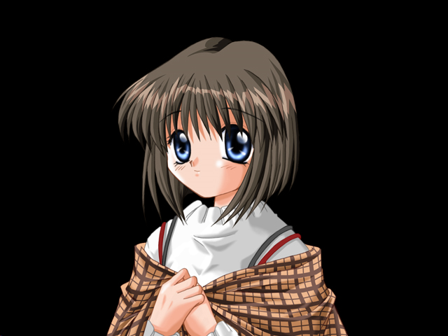
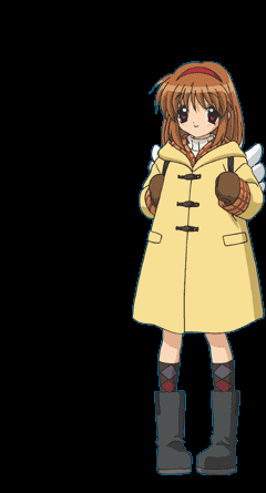
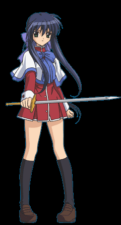
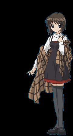
2006 anime designs (Ikeda Kazumi):


First-look impressions:
-Shiori’s shawl changes position a bit depending on the design you look at, one of the more obvious changes in a character. This makes her designs a pain to analyze numerically, since you’re no longer comparing apples to apples (more on that a little later). Related – Mai is only holding a sword in one of those pictures.
-The bright spots in the eyes are a lot more prominent in the game and 2002 versions, whereas the eyes in the 2006 version appear darker and deeper.
-You can’t tell with the game because the full bodies aren’t visible, but you can compare the proportions in the two sets we have full-body shots for. The 2002 characters are ~5.5-6 heads tall, and in 2006 they range from ~5-6.5 heads tall. There’s not a consistent difference one way or the other, but the 2006 designs show a little more visible variance overall. That is noteworthy in that it highlights Yuuichi’s height and Ayu’s relative shortness.
-Yuuichi’s “default” facial expression in his 2006 illustration is a heck of a lot gruffer than his nice smile in 2002. One thing I have read about the 2006 version is that it gives him a stronger sarcastic side.
-Variations of the “1 arm hanging, one arm outstretched” pose seem to be fairly common among the anime picture, presumably because they allow animators to get a feel for what the arms should look like in their most common positions.
-The VN designs are replete with small detail; wrinkles in the clothing, more visible strands of hair, etc.
-The 2002 designs take a little of that under-eye blush art from the original, while the 2006 keeps the lower half of the faces squeaky clean.
—
What the Numerical Breakdown Says:
When I say I’m looking at the designs numerically, what I mean is that I’m using an edge detection algorithm (the same one used here) to get a count of how many unique graphical regions are present in each image. This algorithm breaks down a multicolor image into a 2-color image which indicates where the colors abruptly change. Here’s an example of one such breakdown:
 This process provides a rough picture of which designs are more complex, contain more minute detail, etc. As you may notice, there are details (such as the buttons on the jean jacket) that the algorithm doesn’t pick up on perfectly. Often such small circular features show up as interruptions in the pattern, which does lead to their being counted, but fail to preserve their original shape.
Astute readers may have noticed that the game designs being used here only show the characters from the armpits upward. Since it’s unfair to compare apples to oranges, I’ll be processing two different sets of images for the 2002/2006 designs; one full-body set, and one cropped to include everything above the armpits. That way I can compare the entirety of the 2002/2006 set while still being able to hold them up against the original standard.
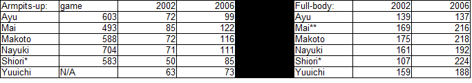
-Takeaway #1 is that there’s no question the VN designs are a lot more detailed, a function of all that small detail that can be added thanks to the lack of demand to be able to animate motion using said designs.
-Comparing just the anime designs, the Ikeda takes are a lot more detailed in general, with the full-body image of Ayu being the only slight exception.
-Comparing Shiori in either shot (shawl) or Mai in the full body shot (sword) is basically a fruitless exercise thanks to the fact that they accessorize differently, something that probably matters less in the average scene but is critically important to this way of looking at the designs. Dropping the plaid shawl on the shoulders removes a ton of detail.
-What I find particularly interesting, though, is the change in the depiction of the lower half of characters’ bodies. Numerically, the majority of the increase in detail in the Kyoto animation release comes from the above-the-pits area, the shoulders and face. Below the hips, the 2006 designs place much less emphasis on the importance of shading and small details. This approach is most evident in the designs for Yuuichi Aizawa, whose boys’ school uniform pants have been stealthily modified to include a check pattern with much larger squares – in 2002, the pants are 3 “squares” wide, but in 2006, they’re only 2 squares across. And since this is a change to not just his pants, but the pants of every male student, it’s a change likely to yield increased efficiency when drawing, say, a classroom or a scene of students commuting to school. Additionally, Ikeda’s choice of color scheme (red on green as opposed to white on green) stands out less, drawing less attention to that area in general. This significance of this design tweak is masked somewhat in the data by the addition of a third button and pockets on the blazer of the uniform, but it’s definitely there.
The other major lower-half design difference, present in every main character design but Yuuichi’s, is the elimination of the third “bright” color used to shade legs and shoes/boots in the 2002 version. Note the difference for Naiyuki’s design:
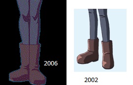
 In both cases, shading is used to give the impression of detail, but the 2006 designs do as well (if not better) while de-complicating that component of the job for color and key animators. That’s a mark in their favor, somewhat offsetting the greater demand in detail produced on the upper half of the body. This is a major reason why Ayu’s full-body detail count is identical in both versions.
—
So that’s what I got out of looking at these designs for a little while. I don’t have any particular thesis regarding what it all means. What’s really motivating me here is a desire for a method of efficiently and equitably analyzing and comparing the differences in designs of visual novels and their adaptations.
For some reason I’m feeling drawn right now to the idea that it’d be fun to have similar detail-change data for visual novel/galge adaptations in the general time period from when late night anime made more mainstream adaptations possible to when Kanon was adapted for a second time. I’m not sure what that data would show, but I’ve got a gut that’s making me curious. I think VN-anime relations in the late-90s/early-00s are a fun, complex topic due to how quickly both were evolving at the time, so I’m going to dive into it to some extent.
Given the availability of websites and game data from the late 90s and early 2000s, this is at least partially impractical. I’ll never be able to acquire *all* the relevant data. But I’ll work with what I can find, use the templates I have. It could legitimately lead to zero more articles or something in the neighborhood of fifteen – we’ll see how far I get.
