Quantifying the tradeoff between two key flavors of anime aesthetics
Magazines may have gone the way of the way of the cel in animation over the past decade, but if you go back and look at the work done in some of those old publications, there’s plenty of merit to the print approach where you have people write up a bunch of mid-to-long-form articles on a given subject. I’ve been forcing myself through a lot of anime-based magazines over the past eleven months, and the grind is well worth the idea fuel it serves as.
In fact, the impetuous for this article comes from one of those magazines – a quote by Toshihiro Kawamoto, Art Production Director for the Cowboy Bebop movie, on the economy of lines in animation;
“I feel [simplified line work] is one of the best ways to approach drawing and animating a movie. Adding even one line to the character designs adds that much more work for the animation staff, which can cost a lot of money.”
Not a terribly shocking statement, really. Of course it takes more time to draw 2 lines than 1, and more time to draw 20 than 5. Seeing the sentiment coming from a pro who was thinking about cost just solidified how it can definitely be a factor in production planning. Anime, (TV series especially, but many movies too) tend to operate on tight production budgets, so even minor cost-saving measures can tip the scales from red to black. At the time, it wasn’t something I payed a lot of attention to, but it put the idea in my head as part of the “factoids that might come in handy during a discussion”.
About a week ago, that discussion happened. I was talking with Sam about the upcoming and inevitably great Digimon 15yo party sequel, which just dropped character designs and part of a staff list. After he schooled cheerios out of me on Keitaro Motonaga-related items, we started talking about character designs. If you haven’t seen them, you can check out the pic here. These are the sort of low-line design Kawamoto was talking about, ones with lots of solid-color clothing, minimal shading and stitch lines, and uncomplicated eyes. It is, of course, somewhat difficult to believe that Toei has plans of going hog-wild with the animation, but the new designs will probably make it slightly easier to sketch a bunch at once then the old ones did. And Toei’s recent history does include one example of Cassel-esque ballsy handling (albeit one that took years to manifest in its completed form). One of the early lessons I absorbed in my first full season following anime was that you can’t predict a show’s destiny just from its character designs, but that doesn’t mean they won’t play a role in dictating where it’ll end up. Or, for that matter, that they’re not well-designed cogs in a larger plan. It’s at least worth thinking about where any atypical aspects of a character sketch originate from.
—
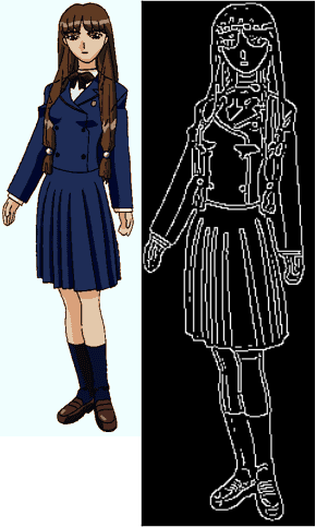
But that sort of analysis ought to go beyond subjective gut reaction, ideally finding a number of different somewhat-quantifiable ways to classify frequently-recurring aspects of design. Image analysis is an extremely difficult field, but simply finding the number of lines in an image is a doable task. I spent last Saturday working up a program that spits out a number approximating the complexity of an image (though it counts something slightly different from the line total). The program employs canny edge detection, which is a method of tagging regions in the image where the color abruptly changes from A to B. This algorithm can be adjusted to be extremely sensitive (and more vulnerable to pixel-to-pixel noise) or less sensitive (more likely to only tag actual lines, but also to miss a few). The result of the edge detection algorithm is a black-and-white image where the estimated sketch lines are shown against a black background. The program then estimates the complexity of the image by counting the number of distinct one-color regions in the post-edge detection frame. This is *not* the same thing as counting all the lines, but it’s a good first-order indicator of how complex the image is (refining this part of the code is a priority).
If the program is going to be useful at hammering out differences in line counts, it ought to be able to distinguish a difference between a series built with line detail versus one optimized for heavy-duty animation. Naturally, comparing different franchises introduces the obvious complications due to different storytelling goals affecting aesthetics, so I’m running the first test the easy way and comparing a single franchise to itself.
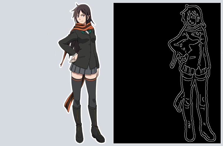
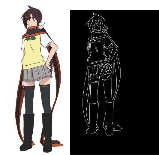
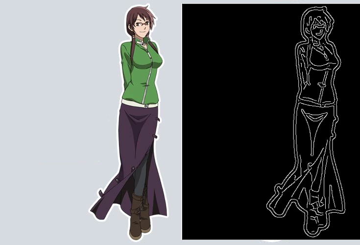
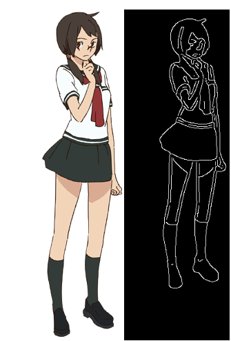
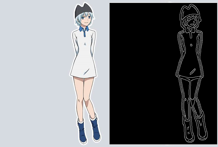
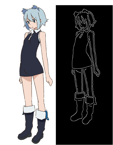
As a franchise whose reboot-turnaround time was all of two years, Yozakura Quartet is a franchise ideally suited to this comparison. While the 2010-and-after Tatsunoko version (a pair of 3-ep OVAs with a TV series sandwiched in between) kept the voice cast from the 2008 Nomad series, they changed up just about every other name on the credit roll. The result is two series with similar casts but very different feels, with designs as different as their respective staff lists. Thankfully, character designs for each series are available from their respective official websites (here and here) – I only had to clip them slightly to reduce each to one image of the character standing.
For simplicity’s sake, I started by just comparing the line totals for the four main characters. Images below show the original designs for each character side-by-side with a map of the edges produced with 2-sigma sensitivity, and the numbers next to the name are the # of regions detected in the 2008 image versus the 2013 image:
Yarizakura Hime [109-108]:
Hiizumi Akina [88-44]:
Isone Kotoha [88-61]:
Nanami Ao [60-53]:
Truth be told, I would have liked to have made the edge detection more sensitive, but the 2008 designs were stored in a somewhat noisy format and 2-sigma was as low as I could make the standard for detection without getting a significant amount of garbage noise there. Anyway, the above charts indicate that 2008 Akina and Kotoha are significantly more complex than their 2013 versions, with Hime being about equivalent and Ao, whose design was simple to begin with, actually being slightly more complicated in the 2013 version. 2013 Hime probably would have come out with fewer lines if not for the checks in her skirt, which add 9 to the image total but I’m calling that one a tie because that does add complexity that wasn’t there in the 2008 version (which had zip-up boots and a blazer). The overall results do indicate a slightly less line-heavy design aesthetic in the 2013 version, which is what I would expect to see. Check one box for this method of analysis, for now.
—
People talk about uncanny valley concerns as one of the main reasons why mecha ended up in CG form way faster than people did, but this angle of thought offers a complimentary reason. One of the reasons mech designs went CG way faster than people did – aside from Satelight’s Shoji Kawamori connection – could be that detailed mechanical designs demand a lot of line work. Examining mechs on a case-by-case basis would be an intensive exercise, given the breadth of that genre, but here’s a quick example. In the 1999 early digital paint mecha series, Dual, there’s a pretty obvious contrast in the complexity of the lead mech versus that of the lead heroine. Designs are again taken from the official website. Here I’m able to use a 1-sigma detection limit, since the source images are much cleaner:
Sanada Mitsuki [144]:
Core Robot [229]:

The mech is almost 60% more complex than the heroine, and it’s hardly the most intense design from the pre-Satelight era. Something like the climax of DYRL is a giant-ass hand cramp if you have to do it once, let alone multiple times. The economics of line saving makes the switch to doing the art once (and then making that model move on a scene-by-scene basis) pretty darn convenient.
It’d also be interesting to take a look at mecha series back in the 90s, when everything was hand drawn, and compare the ratio of lines on mechs and people with the ratio of screentime each got (though you’d have to account for Final Fusions/stock footage in such an analysis).
—
It’s oversimplifying to say that a director’s choices for a given budget tier can be broken down into a binary with “painstakingly illustrated picture drama” and “low-detail high-fps”, but the two ideals of illustration and sakuga can work at cross purposes – detailed costumes and accurate shading are going to really strain a budget for a motion-heavy work in a way that they wouldn’t for one built around applying still cuts effectively. Line analysis offers an opportunity to better understand how the staff of specific shows face different choices in the process of crafting a complete experience.

Wow, after reading this post and seeing what insights you can gleam from anime magazines, I think I’ll give it a spin myself. Which magazines do you typically read and where can you find them?
Not sure if there’s a single magazine that comes packed with knowledge every issue. I’ve been reading though old issues of Newtype USA and Anime Insider for most of my assorted knowledge. You can find most of the interesting articles I’ve found in the “Old Magazine Articles” category on this site: https://animetics.net/category/old-magazine-articles/
I particularly recommend the [inside] series, done by Amos Wong from Newtype Japan and translated to English by NTUSA. That stuff is pretty detailed: https://animetics.net/?s=%5Binside%5D&submit=Search
OtakuUSA also occasionally has a gem, particularly this one with Riichiro Inagaki: http://www.otakuusamagazine.com/Newsletter/News1/Riichiro-Inagaki-Interview-5429.aspx
If you’re looking for interviews in general, you can check out ANN’s interview archives: http://www.animenewsnetwork.com/interview/archive
Obviously, there’s way more material out there, especially in Japanese, but the above are easily-accessible starter courses that come in English.
Thanks, this stuff is really useful!
Pingback: ICYMI: Highlight Posts of 2014 | Animetics
Pingback: Fun With Numbers: Final Fusion in Focus | Animetics
Pingback: Character Redesign in Adapting Kanon | Animetics